Portfolio Website
Personal Portfolio & Blog
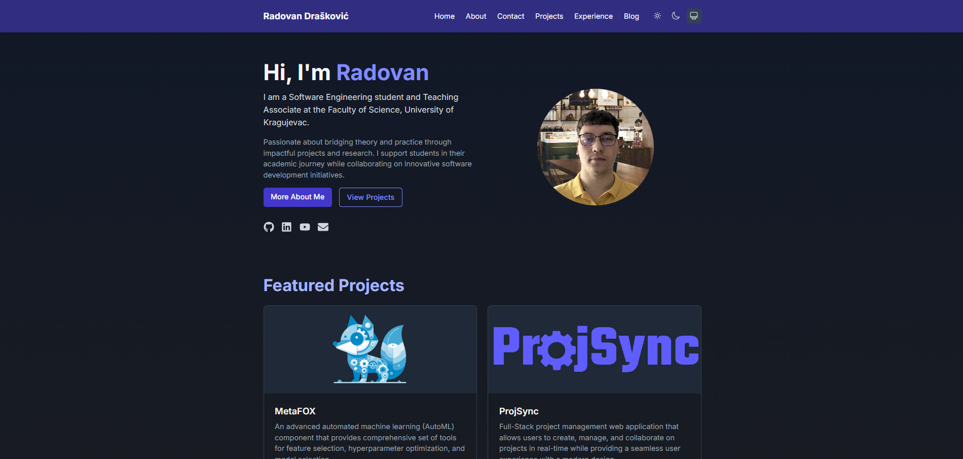
A fully responsive personal portfolio and blog website built with Next.js and Tailwind CSS, featuring a modern design with dark/light mode support. It showcases my projects, skills, experience, and includes a blog section for sharing articles and tutorials.
Overview
This portfolio website serves as a digital showcase of my professional work, skills, and experiences. Built with modern web technologies, it features a clean, responsive design that adapts seamlessly to different screen sizes, from mobile devices to desktop monitors.
The site includes dedicated sections for my projects, professional experience, educational background, and a blog where I can share technical articles, tutorials, and insights. The combination of static site generation and client-side interactivity provides excellent performance and user experience.
Key Features
Responsive Design
Fully responsive layout that adapts to any screen size, ensuring a consistent experience across desktop, tablet, and mobile devices using Tailwind CSS's powerful responsive utilities.
Dark/Light Mode Support
Built-in theme switching between dark and light modes, respecting user preferences while also allowing manual toggling, enhancing accessibility and user experience.
Project Showcase
Dedicated section to highlight personal and professional projects with detailed information, technologies used, and links to live demos or repositories.
Blog Functionality
Integrated blog system that supports Markdown content with syntax highlighting for code snippets, making it easy to share technical articles and tutorials.
Static Site Generation
Leverages Next.js static site generation for improved performance, SEO benefits, and reduced server load, while maintaining dynamic elements where needed.
Automated Deployment
Continuous deployment workflow using GitHub Actions that automatically builds and deploys the website to GitHub Pages whenever changes are pushed to the main branch.
Architecture & Implementation
The portfolio website is built using a modern web development stack with a focus on performance, maintainability, and developer experience:
- Next.js Framework: Provides the foundation with its App Router architecture, static site generation capabilities, and built-in optimizations.
- React: Powers the interactive components and UI elements with a component-based architecture for better maintainability.
- Tailwind CSS: Enables rapid styling with utility classes, reducing CSS bundle size and providing a consistent design system.
- TypeScript: Adds type safety to the codebase, improving developer experience and reducing runtime errors.
- MDX Processing: Converts Markdown content with JSX components for rich, interactive blog posts and project descriptions.
- GitHub Actions: Automates the build and deployment process when changes are pushed to the repository.
The site follows a well-structured organization with separate directories for components, pages, content, and utility functions, making it easy to maintain and extend.
Technology Stack
Next.js
React framework with hybrid static & server rendering, TypeScript support, and route prefetching
React
JavaScript library for building user interfaces with component-based architecture
TypeScript
Strongly typed programming language that builds on JavaScript with static type definitions
Tailwind CSS
Utility-first CSS framework for rapidly building custom designs
MDX
Markdown for the component era, allowing JSX components in markdown content
GitHub Pages
Hosting service for static websites directly from a GitHub repository
GitHub Actions
CI/CD platform integrated with GitHub for automated workflows
Framer Motion
Production-ready motion library for React to create smooth animations
React Icons
Include popular icons in React projects easily with ES6 imports
Implementation Details
Project Structure
src/
├── app/               # Next.js App Router
│   ├── about/         # About page
│   ├── blog/          # Blog page and individual blog posts
│   ├── contact/       # Contact page
│   ├── experience/    # Experience page
│   ├── projects/      # Projects page
│   ├── layout.tsx     # Root layout with navigation and footer
│   └── page.tsx       # Home page
├── components/        # Reusable React components
├── content/           # Blog posts and project data
│   ├── blog/          # Markdown files for blog posts
│   └── projects/      # Project data files
├── lib/               # Utility functions
├── styles/            # Global styles and Tailwind config
Theme Switching
The website implements a dynamic theme switching system that detects the user's system preferences and allows manual toggling between light and dark modes. The theme selection is saved in local storage for persistence across visits.
Content Management
Blog posts and project descriptions are written in Markdown format, which is processed at build time using MDX-bundler, rehype-highlight for syntax highlighting, and rehype-slug for automatic heading IDs. This approach combines the ease of writing in Markdown with the power of React components.
Learning Outcomes
- Modern React Patterns: Implementing React hooks, context API, and functional components for state management and UI composition.
- Next.js App Router: Working with Next.js 13+ App Router for better page organization and server-side rendering capabilities.
- Responsive Design: Creating adaptive layouts that work well across different screen sizes using Tailwind CSS's responsive utilities.
- TypeScript Integration: Adding strong typing to React components and utility functions for better code quality and developer experience.
- CI/CD with GitHub Actions: Setting up automated workflows for building, testing, and deploying the website to GitHub Pages.
- Design Systems: Creating a consistent visual language and component library for the entire website.
- Performance Optimization: Implementing image optimization, code splitting, and other techniques to ensure fast load times.
Explore the Portfolio
Visit the live website to explore all the features, view my projects in detail, and read articles on the blog. Or check out the source code on GitHub to see how it's built.